Berkeley Group —
The Pinnacle
LUXURY RESIDENTIAL PROPERTY BRANDING
– winning pitch
Four Communications were invited by
Berkeley Group to pitch for a branding project for a new luxury residential tower – The Pinnacle in Battersea Reach, London. I was briefed to develop a visual identity comprising of a logo, hero brochure and a specification brochure. The identity was to appeal to young, urban and affluent families.
The Pinnacle tower’s location is overlooking
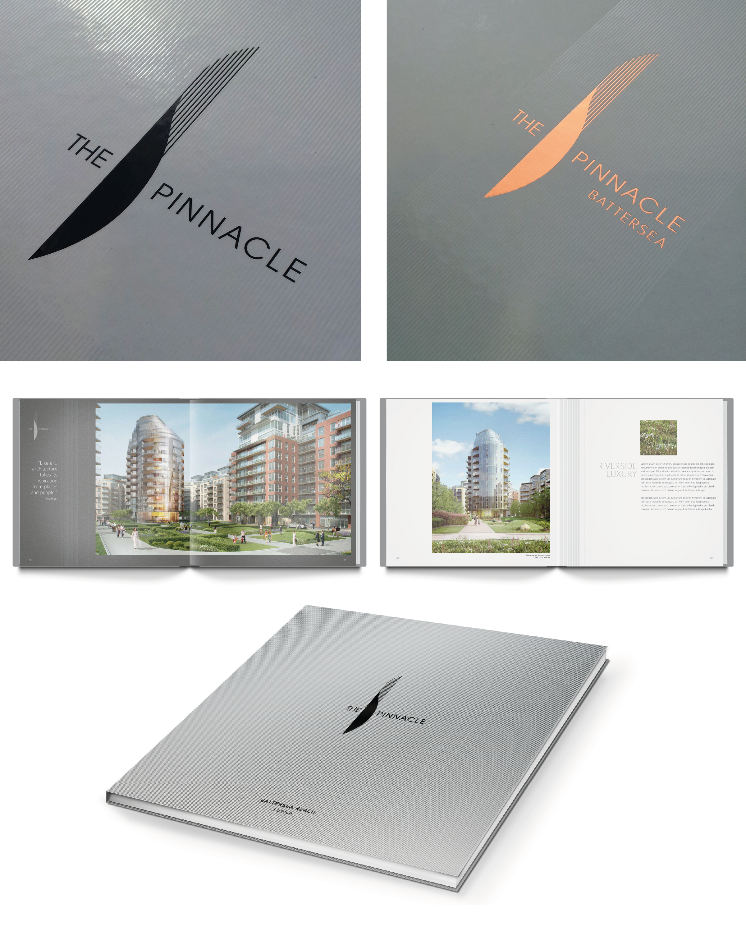
the River Thames, surrounded by park-like landscaping. My logo concept is a visual articulation of the riverside location, inspired
by the flow of the riverbank, alluding to the curve of the building architecture and the stunning views of the river the residents will enjoy. The solid curved shape of the marque is the earth and the Iinear shape represents water. The marque is positioned vertically to support the definition of the name of the tower –
The Pinnacle.
The winning pitch design concepts show the logo on case bound brochures. The covers are textured with raised UV gloss pin stripes, integrating precisely with the linear design of the logo marque. For the endpapers, I produced a pattern using the curved shape of the marque. I designed the content of the brochures with
a minimal layout, giving space to beautiful imagery to pull the viewer in. I added an echo
of the linear pattern from the cover to some of the content pages throughout.
MY ROLE: Art Direction / Branding / Design
CLIENT: St George, Berkeley Group
AGENCY: Four Communications
