

LSH &
Knight Frank —
Cathedral Square
COMMERCIAL PROPERTY VISUAL IDENTITY
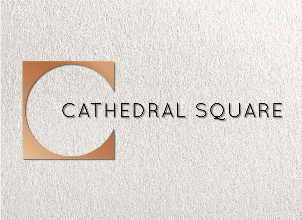
I created the art direction for new office premises in Guildford. The logo I designed alludes to the light and spacious attributes of the building’s architecture. The marque is the curve of the letter C cut out of a square referencing the adjacent, historic Cathedral Square, which the build is named after. The marque was used for signage and as a graphic device which I designed for print and online. Ultimately the logo, with some font variations, was rolled out across all premise branding.
MY ROLE: Concept / Design
CLIENT: LSH & Knight Frank Properties
AGENCY: AP Marketing