

Martins Properties
— Dovehouse Parade
LUXURY CHELSEA DEVELOPMENT IDENTITY / BRANDING
Four Communications were pitching for the Dovehouse Parade development branding project. I was asked to create an identity design for the new development of boutiques, cafés and restaurants on the Kings Road in Chelsea, London. The brief was to appeal to young professionals, which was the demographic in terms of who lives, shops and socialises around the Kings Road.
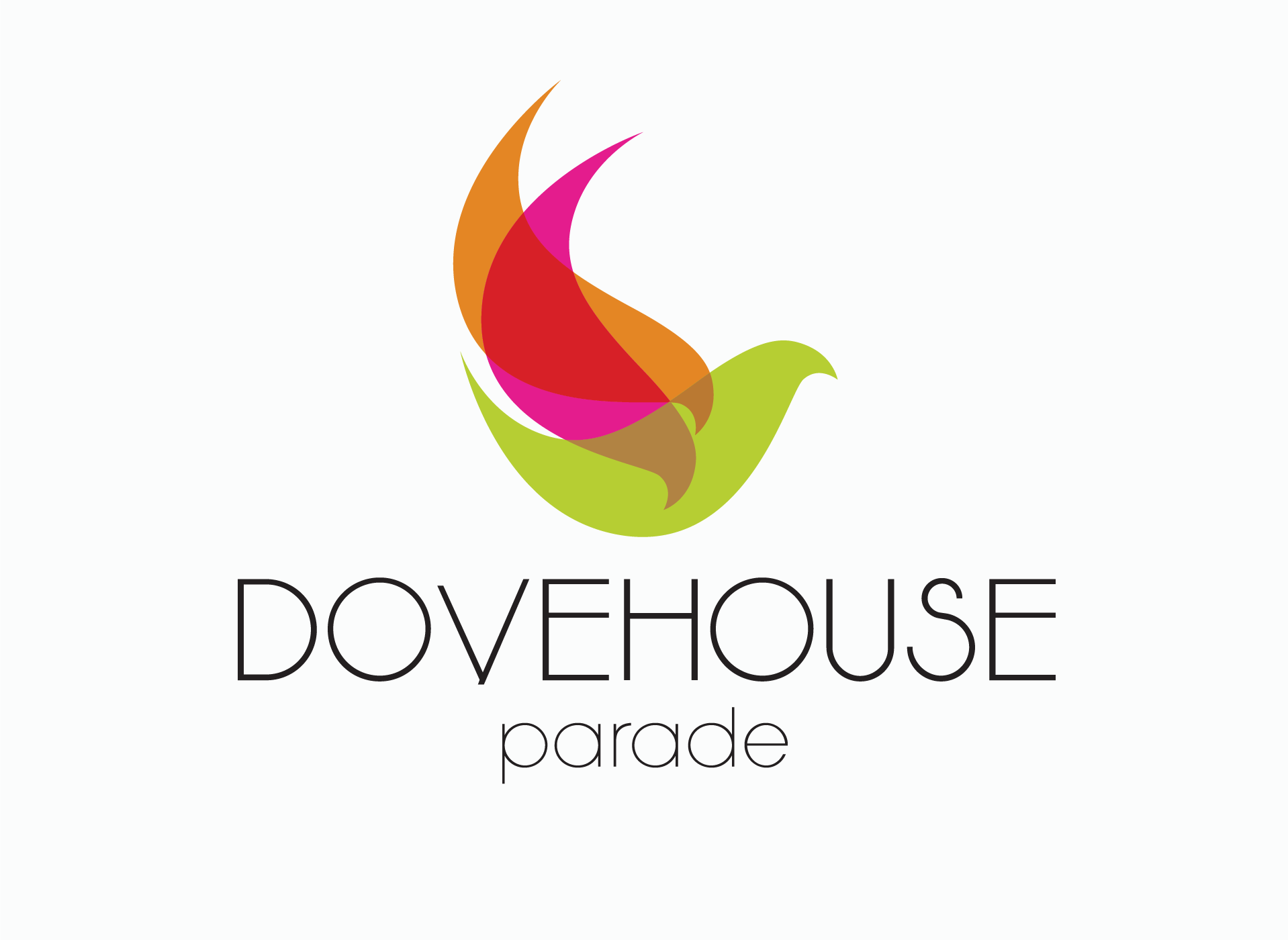
The inspiration for the dove motif came from the historical presence of a dovecote on the adjacent road – Dovehouse Parade, also the name of the premium development. I decided
to use a bold colour palette, as the creative heritage of the location with its many interior and fashion boutiques and a fashion legacy going back to Vivienne Westwood and
Mary Quant, has never been anything less
than flamboyant.
As I developed the logo concepts, I liked the idea of being able to deconstruct the marque
in order to configure the shapes into various patterns for use on various touchpoints. I drew one bird shape and repeated it for the wings. Using three overlapping colours to create new tints gave the marque a light, contemporary
and bold aesthetic.
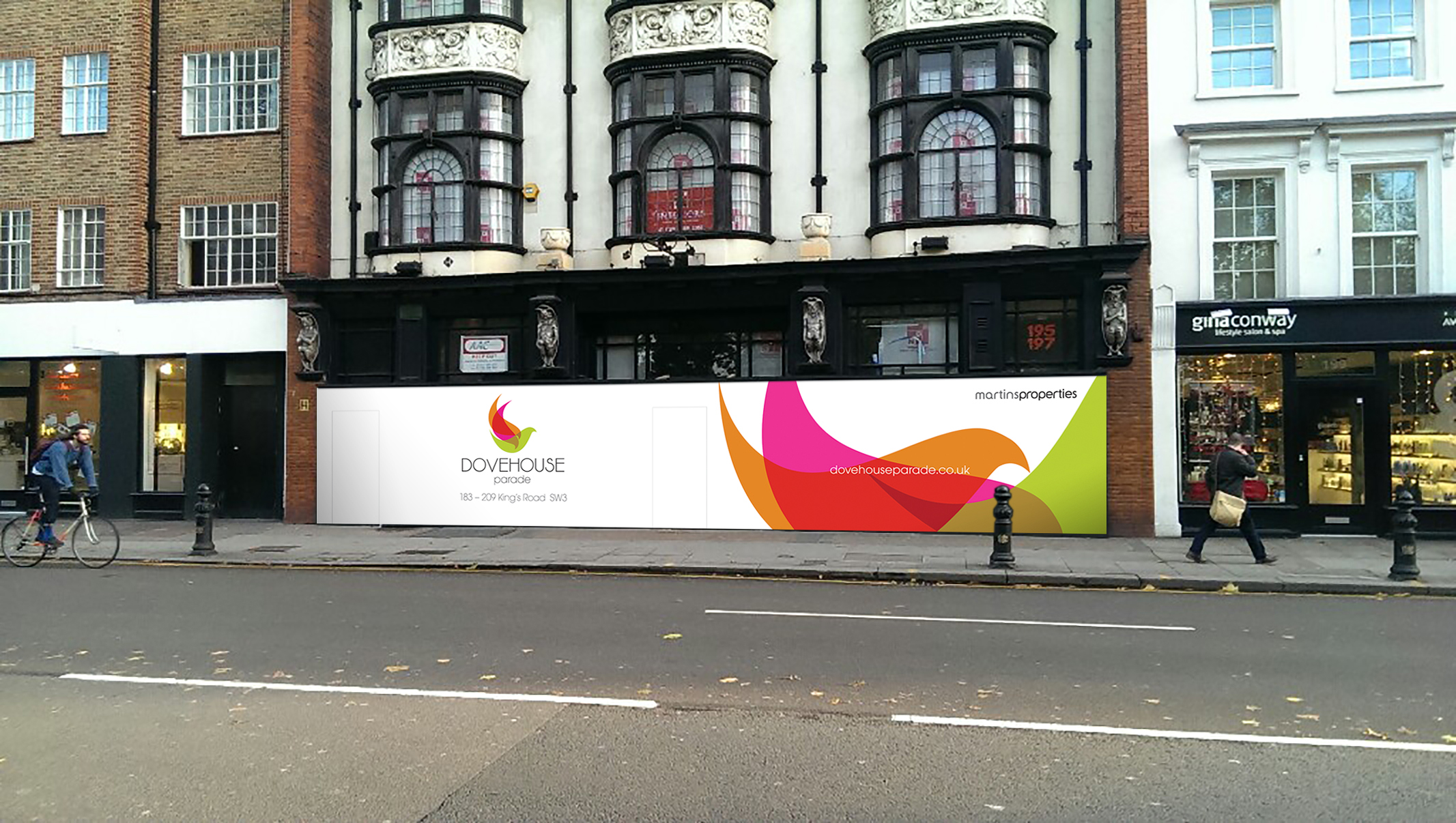
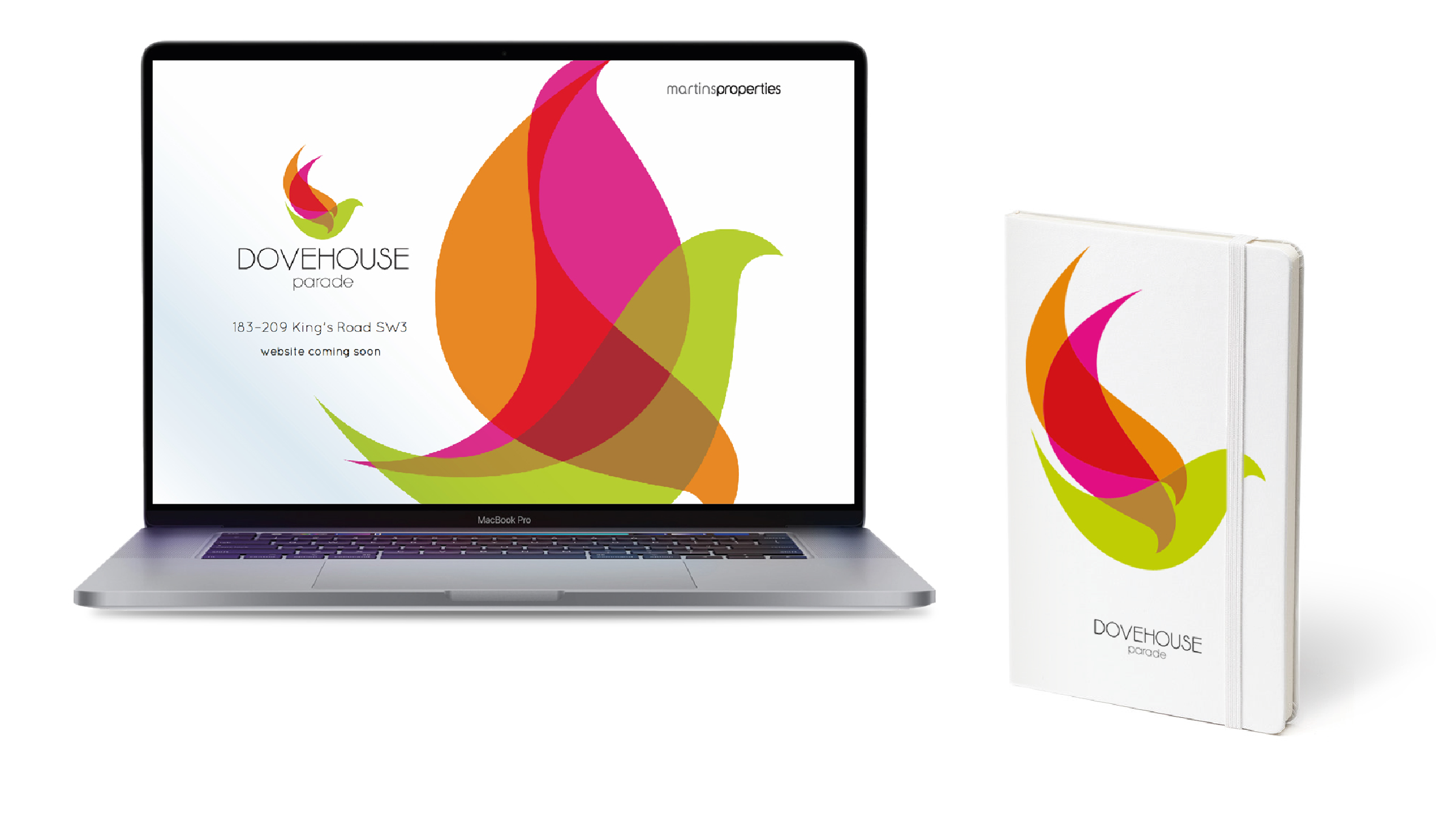
We won the pitch with Martins Properties and subsequently, the marque worked perfectly applied to the building hoarding in a deconstructed pattern of shapes, creating a sense of movement. I used the logo marque in
a similar way on the property website.
MY ROLE: Logo Concept / Design
CLIENT: Martins Properties
AGENCY: Four Communications
