
LSH &
Knight Frank —
Cathedral Square
COMMERCIAL PROPERTY VISUAL IDENTITY
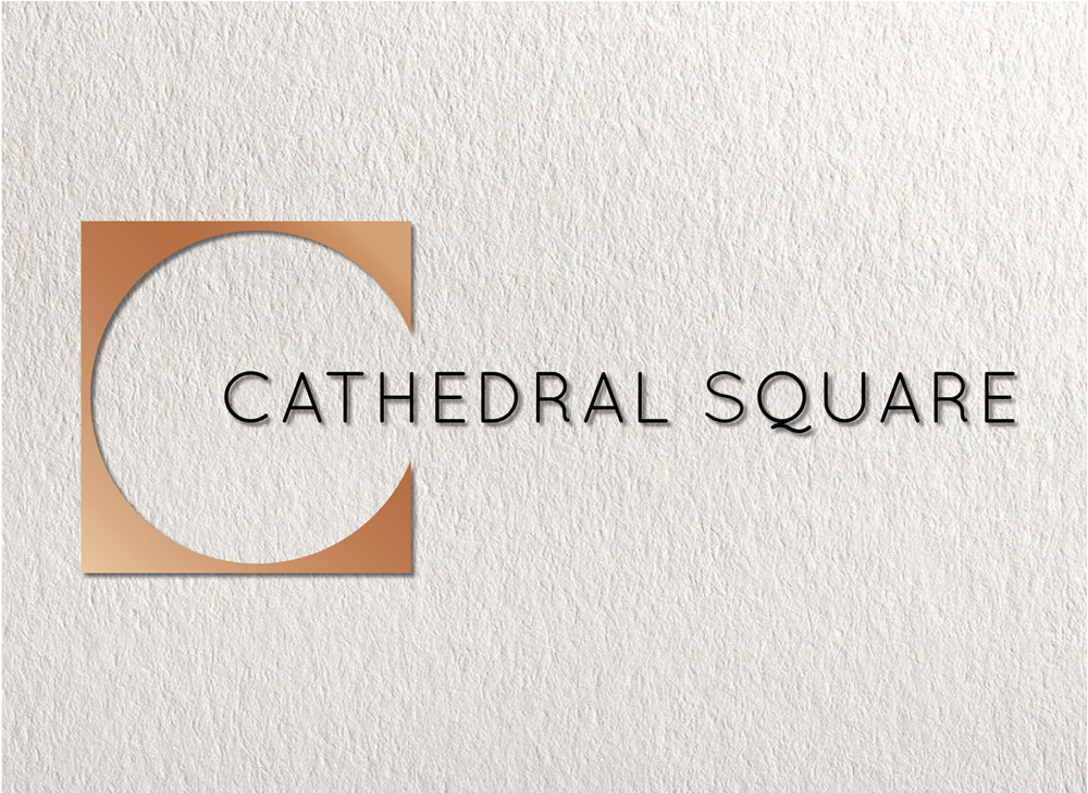
I created several logo designs for new office premises in Guildford. The logo alludes to the light and spacious attributes of the building’s architecture. The marque is the curve of the letter C cut out of a square referencing the adjacent, historic Cathedral Square, which
the build is named after. The marque was used
for signage and as a graphic device which
I designed for print and online. Ultimately the logo, with some font variations, was rolled out across all premise branding.
MY ROLE: Logo concept / Design
CLIENT: LSH & Knight Frank Properties
AGENCY: AP Marketing
